Sunday, March 29, 2009

Difficult Run, Vienna Virginia


Childhood Memories of the Creek Bed

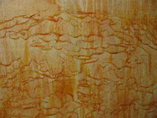
Difficult Run is a stream bed that runs through my life like a thread through a quilt. As a child I played in it with my older brother Nick and as an adult I ramble along its banks in awe of its natural design. I have written a new artist statement. This statement is more in harmony with my work and my life.
I feel I am getting closer and closer to the core of my work and where it comes from. And this past week has been spent researching and filling up the image bank for more images to come this spring.
This past week, I had the privelege of meeting the education specialist at Meadow Lark Gardens. I was on a quest for information about my "Earth Objects". My new friend is a scienctist who happens to be as passionate about these tiny objects as am I. She will be helping me identify the genus and species of the plants, pods and seeds that I paint.
My work is focused on native plants in the Difficult Run Watershed of Northern Virginia http://en.wikipedia.org/wiki/Difficult_Run. My new friend is a kindred spirit. She seeks to preserve the natural forests of the areas in the Gardens and I seek to immortalize them.

Monday, March 23, 2009

STAY THE COURSE, 4 feet x 12 feet, acrylic on canvas...

Today's canvas was started on Saturday. After I rolled out the huge 8 x 12 foot canvas, (which is actually a drop cloth) I noticed a seam about 1/3 of the way down the cloth. Instead cutting into the cloth with the intention of stretching onto canvas bars later, I decided to cut along the finished seam and keep the finished edge. I then had a 4 x 12 foot canvas with a completely finished edge all the way around.

Presentation is a huge issue when I am hanging a show or canvas. Usually I stretch my images around stretcher bars and use the stretcher bars as my frame. I have been doing this for many years. But these new images don't need stretching because the frame is the raw gesso that is tinted on the rim of the canvas. The good news is that I can roll these up and they are portable. I can take them anywhere. This is great since now the size of my vehicle is not an issue. I used to have to design my paintings around how I could transport them. Now all I have to do is roll them up.

"Stay the Course"seems to be my life's theme presently. A few weeks ago my cousin Marissa showed me a cool site on Facebook that matches your birthday with the #1 billboard song on that day. Guess what mine was for October 6, 1960. Larry Verne "Please Mr. Custer". http://www.facebook.com/ext/share.php?sid=60926121015&h=9vNT3&u=7-1gV&ref=mf
what does this have to do with art and me. I thought it was funny to have such a silly song for my #1 song at the time of my birth. But the weird thing is, I have been using the theme of "stay the course" in my daily meditations recently. The U-tube video has a sub title on it Custer "stayed the course" and that is precisely what I am trying to do in my own life. I have endeavored to be more disciplined in all areas of my life.

Yes I know I am talking about virtues, because I believe that being an artist requires strong virtues. Artists need to be strong and disciplined and quite simply, "stay the course". We don't have a paycheck to motivate us everyday to go into the studio. Going into the studio every day without pay requires discipline, money and support. How do we do this? Well most of us work two or three part time jobs in order to carve out creative time. I am no exception. I currently work on web page jobs and teach part time. I don't have the luxury to paint at my leisure. And that brings me to the "why I paint". I paint because I have an internal drive to do so. My drive propels me to "stay the course" but sometimes it is sheer determination and tenacity that keeps me going back into that studio day in and day out. When I finish a really physical painting session I feel relieved. I also feel as if I have done battle with the canvas. Isn't it ironic that my song is...."Please Mr. Custer"...and yes I am paying attention to the "guide-posts along the way. Especially the ones that are sometimes given to us by our wonderful cousins on Facebook. Thanks Marissa!

Studio Photos from 3/21-3/23...Enjoy


Wednesday, March 18, 2009

Acorn Homage, revisited and final coat

I worked back into this image yesterday to tone down the highlights and bring back some of the sepia tones.
It was good that I took earlier stage photos of this image because I was able to see that it read better when toned down. The final highlights are now flickering through the coat of warm orange brown than was added to tone them down. I am satisfied with this image and ready to show it to the world.
Yesterdays Studio Session
I am working the background into this image. The object seems to be taking on a life of its own. After placing a heavy coat of green mixed with purple I then wiped away with a sponge to reveal the light layer of green underneath. My sponge wipes were in the same direction of the pine pod and seemed to be going in an upward direction. The pod has an aura surrounding it and is taking on a life of its own.

Monday, March 16, 2009

Acorn Homage, 65 x 48,. acrylic, 2008


I finished Acorn Homage today. It was a great deal of fun as I was brushing the many layers of translucent pigment over the acorns. Each layer added new depth to the markings that surrounded the acorn.
Before the final coats.


New Image started today. Pine Person. Huge painting carved out today with many markings that seem natural in the process of documenting this image.


Monday, March 9, 2009

Studio Session, March 9 2009

Today I began the journey of building up the surface of this large painting. I used a lot of gel medium along with the scraper to build out the image. I applied a coat of burnt sienna and then scraped it away only to realize I needed a darker earth tone. I rubbed burnt umber into the acorn image and spread out the darker tone throughout the ground. Next I scraped away and revealed a darker imprint. The final stretch was spent taking the canvas off the wall and balling it up to make it look older and worn. I then threw clear water and watched it etch into the surface lines that drip revealing areas of light from beneath. I battled with this canvas and walked away pleased with the wining results. When the surface has enough areas built up I can then begin the long and tedious process of brushing over light layers of pigment to conceal and reveal the image. I find myself concealing and then revealing with each layer of paint. Each brushstroke adds or subtracts from the surface ground and builds on top of one another.

Saturday, March 7, 2009

Spring Releaf, 36 x 48, Acrylic on Canvas, 2009


This morning I finished this painting that has been hanging out in the studio for over a year. It has had three lives. The first and second lives had different color palettes. The previous days post shows the painting in its second life before I worked on it again. As I was layering the the fine mists of paint with my brush I felt like I was brushing out the image. The image appeared with each new bath of pigment that was lightly stroked over the entire image with a large painters brush. I apply layer after layer of color until it fully comes to life and has emerged in the final stage. I call this painting "Spring Releaf"...need I say more.

The image looked like this this morning before beginning the work. I made a decision last night to begin todays session with a pink tinted overlay. I needed to tone the green down again.


Next I added the final highlights of yellow that would finish it off and reset the mood I want to invoke with this painting.


The yellow tint brings up the texture on top of the ground and sets the other pigment colors below the surface. Each layer of this lightly applied pigment creates an illusion of depth and the leaf begins to submerge below the surface of the paint.

Friday, March 6, 2009

Studio Session March 6, 2009


Todays session is a continuation of yesterdays image.  I started by mixing a wash pigment to coat the entire canvas.  The wash is made up of 90% water and a teaspoon of orange paint.  I tinted the paint to lower the intensity with purple. 

Next I apply the stain to the canvas.  The image carved into the canvas yesterdaya begins to reveal itself.
After applying the stain I dab at the canvas and remove excess paint in areas I want to accent the image.
This gives you an idea of the subtle markings that the stain has lifted out of the ground.
Next I applied the acrylic gel with the same scraper I used yesterday to apply the gesso.  I apply it only in the area of the canvas I am carving into.  This is a second layer of carving.  It is a carving on top of a carving giving this image a multi layer effect.  The gel will dry clear and I will then wipe paint into the grooves to begin the unearthing process.
I must let this dry for about 24 hours.
I move on to another canvas I began last year.  Today is the day to finish it or at least bring it up to another level.  Again this canvas is calling me to work on it.  I have been looking at it for weeks and finally made a decision to work into it again.  I decided to use an acrid green color which is a fancy term for green mixed with yellow.  I like the contrast of the lime green and the purple. 
The image is a high contrast of yellow and purple before I work into it.
I decide to sand it down to make it more giving to the paint.  I also like the white highlights that the sanding brings back into the image.
I work into it with a very simple palette.
After working into it with the lime green the image has now complete transformed.  It is not done and needs a few more thin layers of paint in other colors that are in the same family. 
And finally we have the end of todays studio session.  The image is completely transformed.  I have a few more layers of color to add.  These will very light red purples and bright yellows.

Thursday, March 5, 2009

Image Archaeologist™

Today I wrote a new artist statement to depict my current work. The writing lead me into changing the look of my whole blog and also changing the name. I am still "a painter who blogs but my new statement will explain why I changed my blog title.

My New Artist Statement
I describe my self as an Image Archaeologist™.
My images evolve out of the surface of the canvas by carving into the wet gesso with the butt of a paintbrush. I dig into the surface to carve out the image and then brush layers of paint over the dried gesso imprint to unveil the etched surface ground. The carving is uncovered by rubbing paint into the surface grooves. Multiple layers of paint are brushed lightly over the beveled edges unearthing the image. Each layer adds an illusion of depth and is brushed and wiped away as the image unfolds. The image is found within the surface ground thus making it “image archaeology. This is my approach to the process of painting.
Today's painting is called Two Ipods. Painted last week it seemed appropriate to post as the original "Ipod" painting was a part of the "Mid Atlantic Painting Exhibition" last January at Mary Washington University. Ipod is the first in my series of images I call "earth objects".

Studio Session March 5, 2009


Todays session begins with canvas preparation. This is the raw canvas I work with. It is actually a large canvas drop cloth I purchase from the Home Depot. I cut it into quarters and then apply gesso with a plastic scraper. Applying the gesso is a lot like icing a cake.


I place blobs of gesso onto the canvas and then smooth out the gesso with the plastic scraper. After the gesso is applied I then staple my wet gessoed image onto my studio wall.


Now I carve into the gesso an imprint with the butt of my paintbrush. This imprint has organic shapes and it will become the backdrop to my earth object that is being unveiled.

Todays session shows how I mix paint to come up with the right earth tone. By mixing orange with its complimentary color purple, I get just the right tone. Mixing complimentary colors will de-intensify a color without making it muddy.


It’s called the Munsell system of color mixing. I have been using Munsell color theory in my work for over 15 years. Munsell believed that additive color, or color from pigments should be as close to what the brain perceives as possible. He scientifically proved that the opposite of red is not green but blue green. If you stare at a red piece of paper for 40 seconds and then quickly move your eye to a white piece of paper you will see blue green. The brain automatically mixes the opposite color for you.

You can do this with any pigment color. The color wheel then becomes what your brain sees in nature rather than a theory that has been manufactured. I will talk more about Munsell and color mixing in the future as Munsell is very important to the development of my work.

Tuesday, March 3, 2009

Green Nut, 40 x 40 acrylic on canvas


This image is another of the nut series images. It has a bright green surface with many layers of green and organic textures underneath. This image was carved out of the butt of my paintbrush and then painted and erased away many times before the final image resulted. It has been "unearthed" from the surface. Like an "image archaeologist", I dig away at the surface and layers until the right textures remain highlighted and uncovered. It is this adding of pigment and rubbing away that gives it a fine patina look in the end.